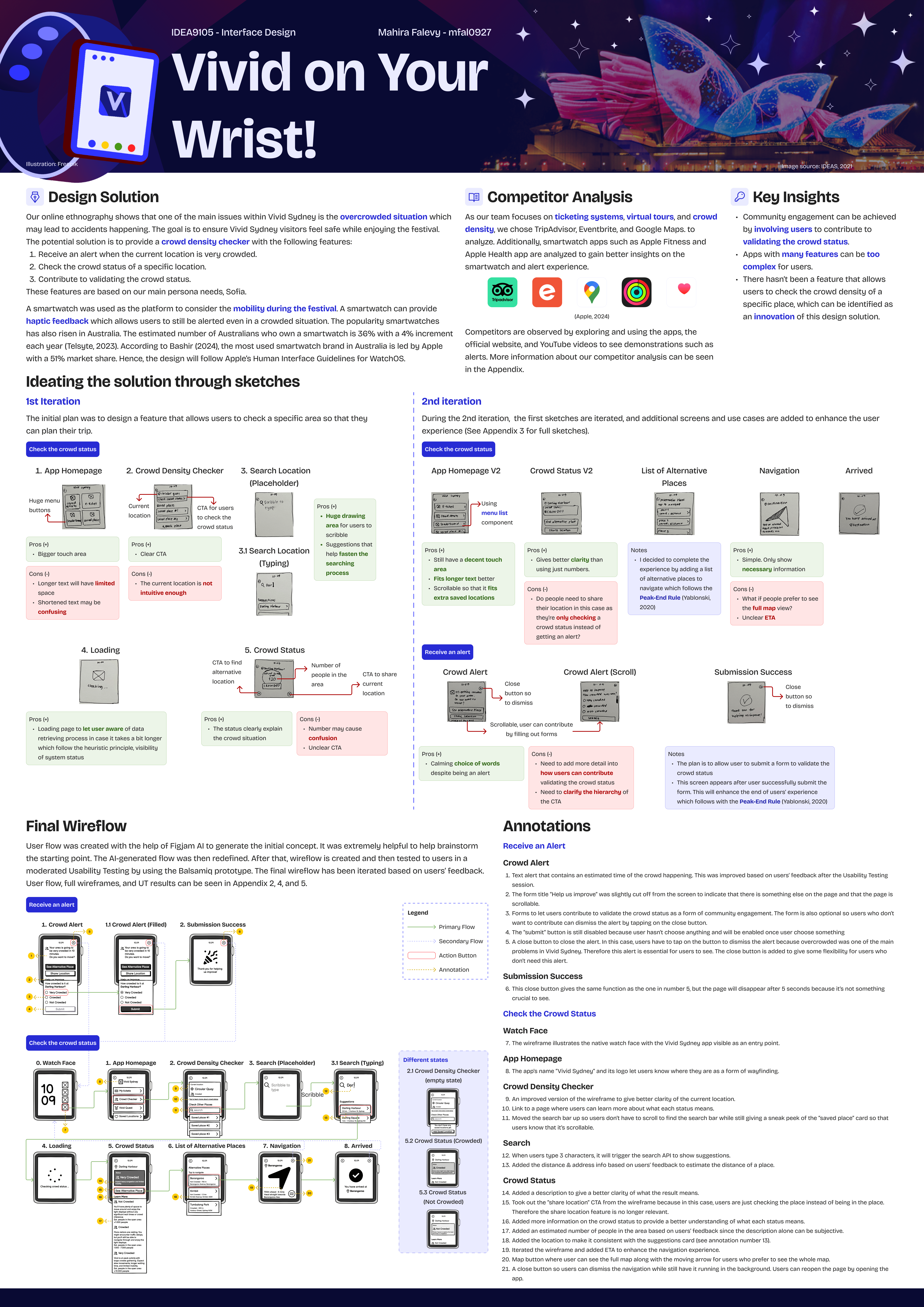
Overview
Vivid Sydney attracted around 2.42 million attendees across Australia and worldwide in 2024. As one of the most significant events, crowd management is a crucial aspect of a successful event. One of the major problems we encountered during our online ethnography was the overcrowded situation. Hence, a crowd density checker becomes one of the solutions. This case study was conducted as part of a group assignment for IDEA9105 Interface Design at the University of Sydney. My group chose Vivid Sydney as the event to address the design brief, and we focused on the community and engagement aspects of the event. Each of us tackled a different platform as a design solution.
Role
Product Designer
Timeline
Aug - Nov 2024
Scope
User Research, Interaction Design, Wireframing, Usability Testing, and UI design
Platform
Smartwatch: Apple WatchOS
Background
Sydney is known for its vibrant public festivals, with Vivid Sydney standing out as one of the most anticipated annual events. Running since 2009, Vivid attracts millions of visitors each year with its large-scale light installations and cultural programming. However, the growing crowd size has also raised safety and social concerns, including congestion and reduced mobility. This project aims to foster greater social awareness and a sense of shared responsibility among attendees by helping them make informed decisions during the event.
Design process
We used the Double Diamond framework to answer the design brief, following the stages which are; discovery, define, ideate, and develop.
— The first half
In this part of the design process, we will focus on understanding the problem and choosing which problem to solve. We start by expanding the knowledge through user research and narrowing down our findings with the help of design toolkits to analyze them.
To better understand the context and our users, my team and I conducted user research by doing online ethnography. We observed social media as people tend to give more honest reviews on those platforms such as Reddit, X, Thread, YouTube, and Instagram.
Key insights
Overcrowded
"It’s so crowded you can’t move in the crowd and feel like you’re going to die by stampede."
"Paramedics were basically dragging people out of the crowds left right and center last night."
Too commercialized
"First time for vivid, but I waited 3 hours to watch a Netflix ads. I was very surprised."
"How about you spend some of the money you make your ticketed events to improve safety for the community.”
Quality & guiding system
"How about sending out notification a little earlier than 5.40pm?... the lack of communication... Vivid Walk was non- refundable and open.”
"No signage nor directions."
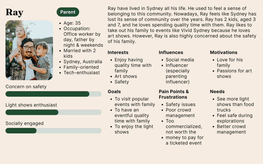
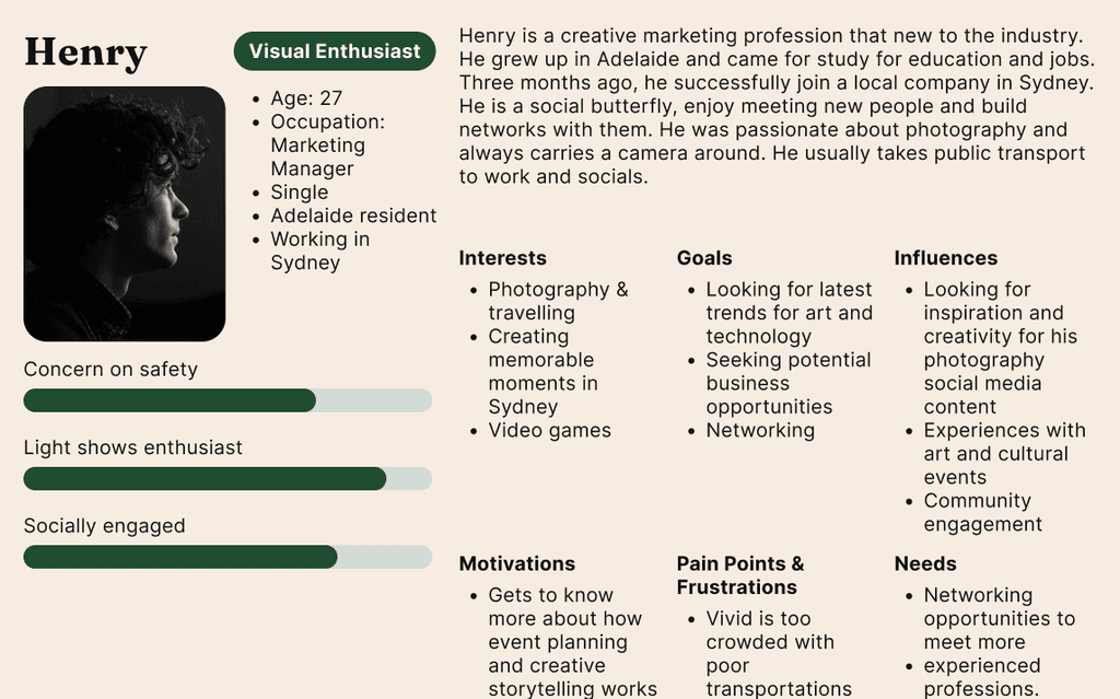
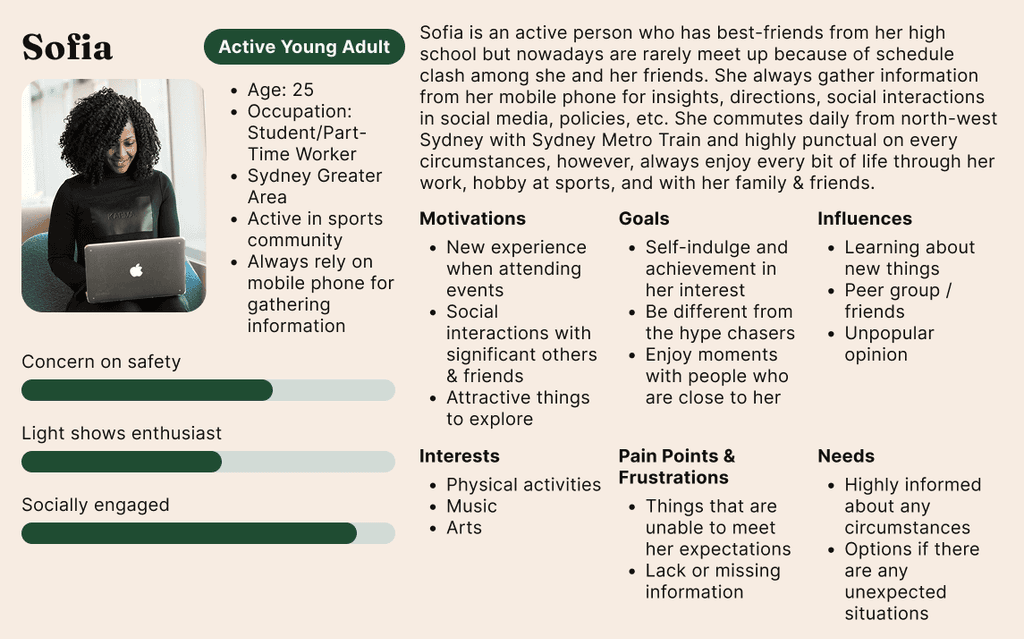
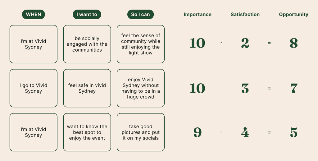
Based on the online ethnography, we formed 3 personas that represents our target users.
Combining our personas with Jobs-to-Be-Done (JTBD) Framework, we identified goals that might be relevant for each personas and prioritized them by calculating the opportunity scores.
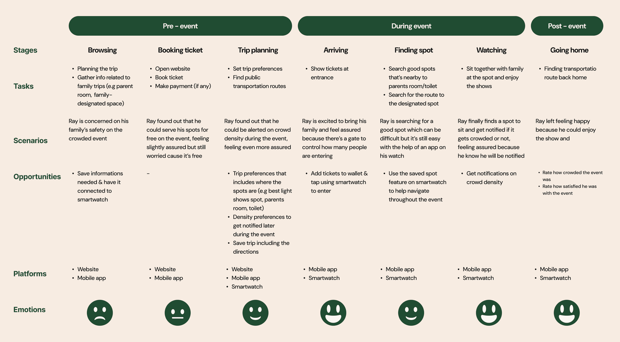
To better understand the user experience, we mapped a journey based on our prioritized design opportunities and aligned it with our key persona, Ray — a parent attending the event with children. The journey was divided into three stages: pre-event, during the event, and post-event, allowing us to capture the full spectrum of the experience. This breakdown helped us identify key pain points, unmet needs, and design opportunities at each stage of the festival journey.
Final HMW Statement
How might we make someone feel safe in Vivid Sydney's crowd?
— The second half
From the narrowed-down problem, we begin the second half of the design process by expanding ideas and refining them later to develop the final solution.
Focusing on the key persona, Ray the parent, I started ideating the solution by answering the final HMW statement. One of the opportunities we've identified is to notify users of the crowd density status.
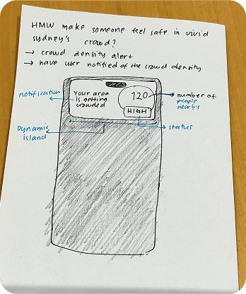
What can be improved from this?
- Adding a CTA to let users explore more places
- Adding a map and telling people how crowded the area is
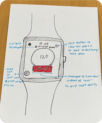
What can be improved from this?
- Need a title to explain the context
- Use more descriptive words (e.g crowded/not crowded) instead of “high”
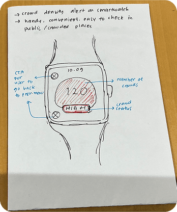
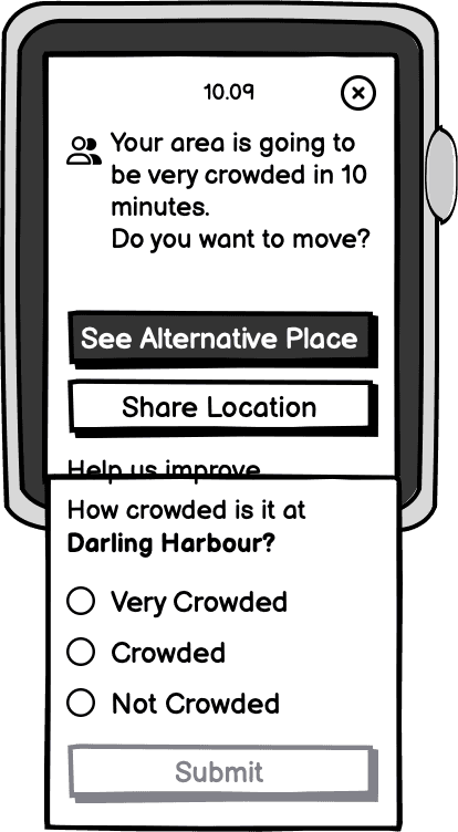
Refined crowd density alert after improvements
Our online ethnography reveals that one of the primary issues within Vivid Sydney is the overcrowded situation, which may lead to accidents occurring. The goal is to ensure Vivid Sydney visitors feel safe while enjoying the festival. The potential solution is to provide a crowd density checker with the following features:
- Receive an alert when the current location is very crowded.
- Check the crowd status of a specific location.
- Contribute to validating the crowd status.
A smartwatch was used as the platform to consider mobility during the festival. A smartwatch can provide haptic feedback, allowing users to remain alerted even in crowded situations. The popularity of smartwatches has also risen in Australia. The estimated number of Australians who own a smartwatch is 36%, with a 4% annual increment, and the most used smartwatch brand in Australia is led by Apple, with a 51% market share. Hence, the design will follow Apple’s Human Interface Guidelines for WatchOS.
As a user, I want to know the crowd density status of a specific location so that I can feel safe during Vivid Sydney
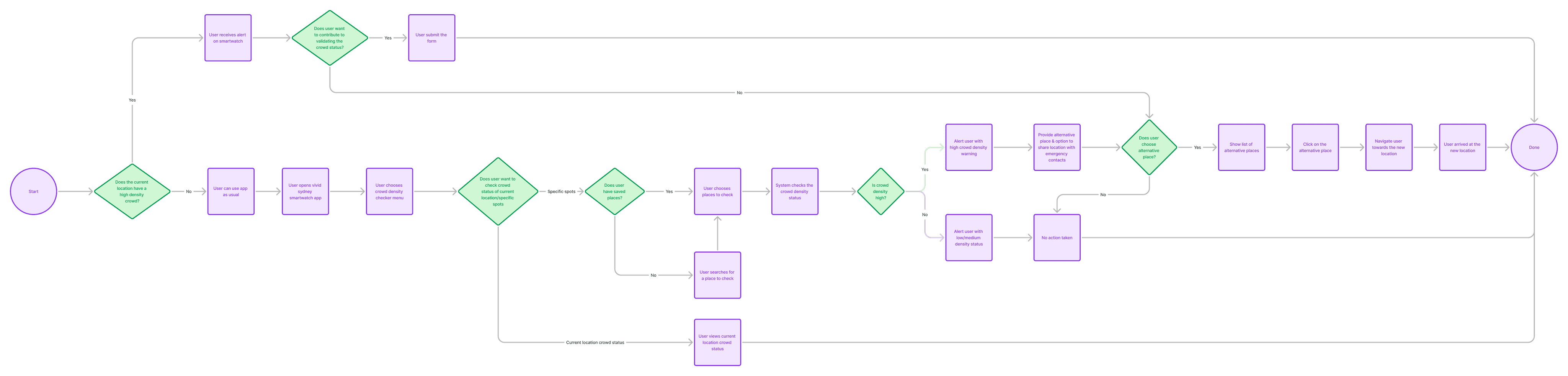
This user flow evolved through several iterations and feedback from teammates and the creative director. It captures the key interactions needed to reach the user's goal.
Research can be conducted at various stages of the design process to inform and validate decisions. In this project, I performed a competitive analysis to explore how existing platforms approach similar problems. The focus was on understanding how competitors design for crowd-related challenges, alert systems, and smartwatch interactions.
As our team focuses on ticketing systems, virtual tours, and crowd density, we chose TripAdvisor, Eventbrite, and Google Maps. to analyze. Additionally, smartwatch apps such as Apple Fitness and Apple Health app are analyzed to gain better insights on the smartwatch and alert experience.


Competitors are observed by exploring and using the apps, the official website, and YouTube videos to see demonstrations such as alerts.
Key Insights
Community engagement can be achieved by involving users to contribute to validating the crowd status.
Apps with many features can be too complex for users.
There hasn’t been a feature that allows users to check the crowd density of a specific place, which can be identified as an innovation of this design solution.
After defining the key features, I developed the user flow and began sketching the necessary screens. The wireframing stage involved multiple iterations and explorations, as I continuously refined the layout and interactions to improve clarity and usability.
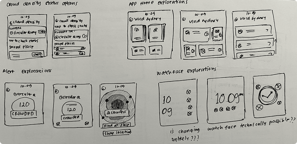
Iteration on Homepage
Iteration 1
Huge menu buttons
Pros (+)
- Bigger touch area
Cons (-)
- Longer text will have limited space
- Shortened text may be confusing
Iteration 2
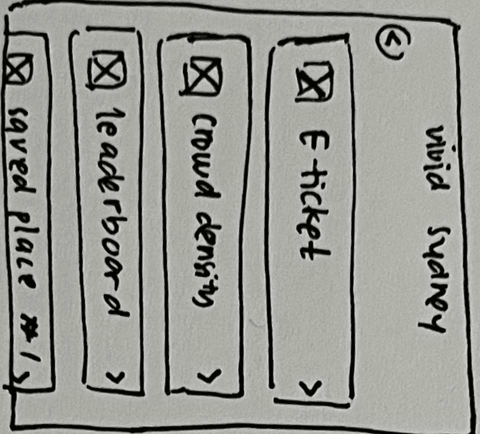
Pros (+)
- Still have a decent touch area
- Fits longer text better
- Scrollable so that it fits extra saved locations
Iteration on Crowd Status Page
Iteration 1
Current location
CTA for users to check the crowd status
Pros (+)
- Clear CTA
Cons (-)
- The current location is not intuitive enough
Iteration 2
Pros (+)
- Gives better clarity than using just numbers.
Cons (-)
- Do people need to share their location in this case as they’re only checking a crowd status instead of getting an alert?
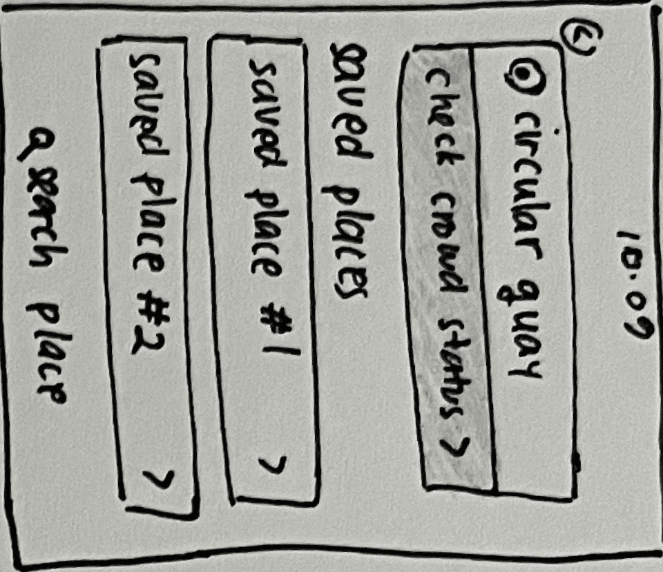
After many rounds of iterations, I finalized the wireflow on balsamiq and tested them on potential users. There are some findings from the testing and here are some of the improvements made.
Improvement
Wireframes
When users get to this page, they want to know how far the place is to help their decision-making process. Users want to check the closest place to them.
Before
After
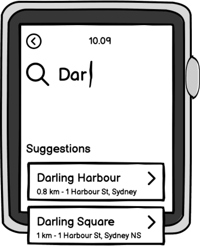
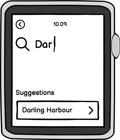
Users feel like there needs to be some sort of standardization of how crowded a place is in a quantified value. The exact number will require some complex calculations. Therefore, an estimated number is added.
Note: the estimated number will also require some calculations but probably not as complex as getting the exact number and still leaving a margin of error.
Before
After
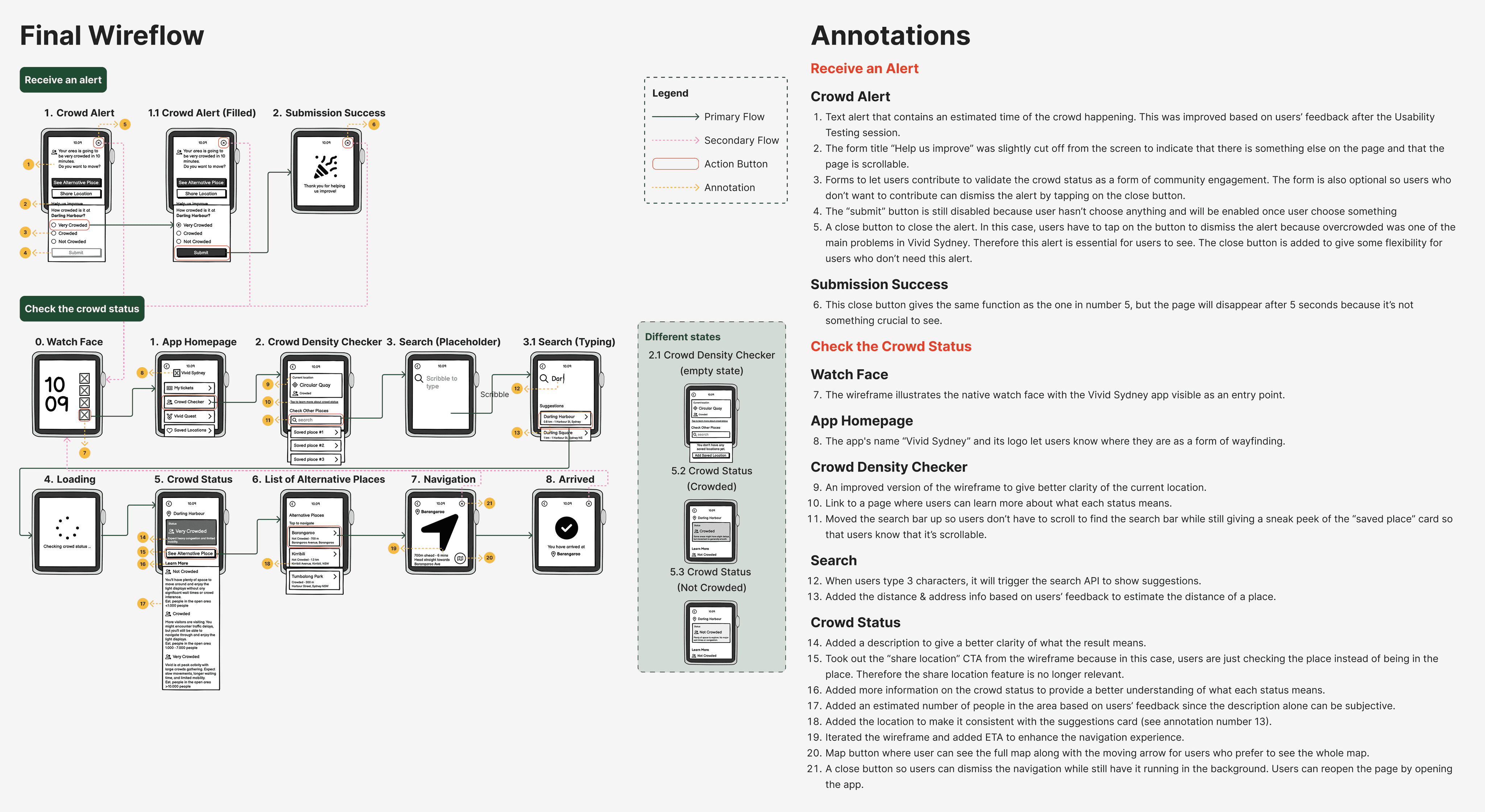
The final wireflow is finalized after many rounds of iterations. Here I also annotated the design decisions behind each screen.
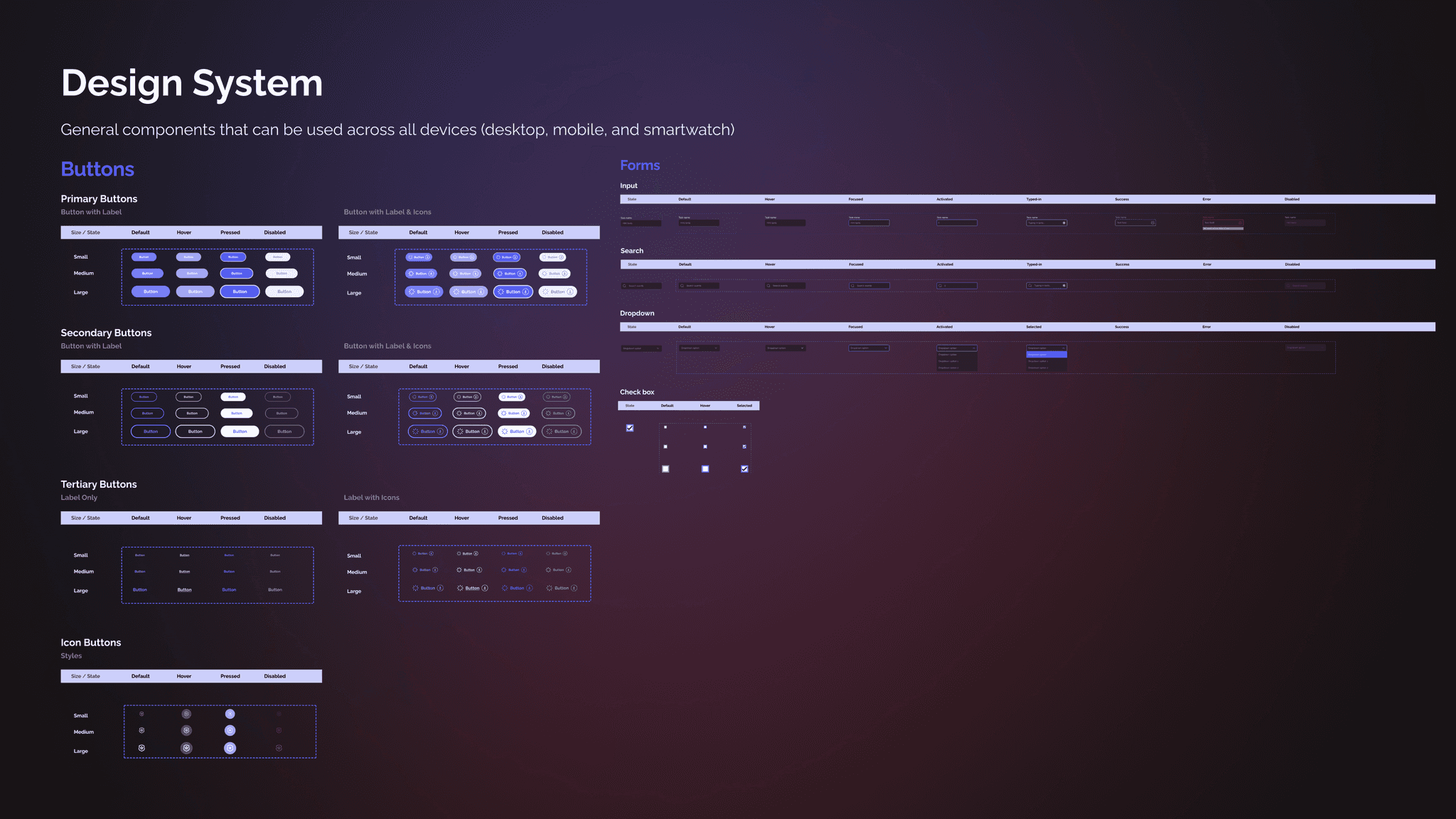
It's time to develop the final solution. After gathering many feedbacks, my team and I decided on a visual identity and we built a shared design system to maintain consistency across platforms.
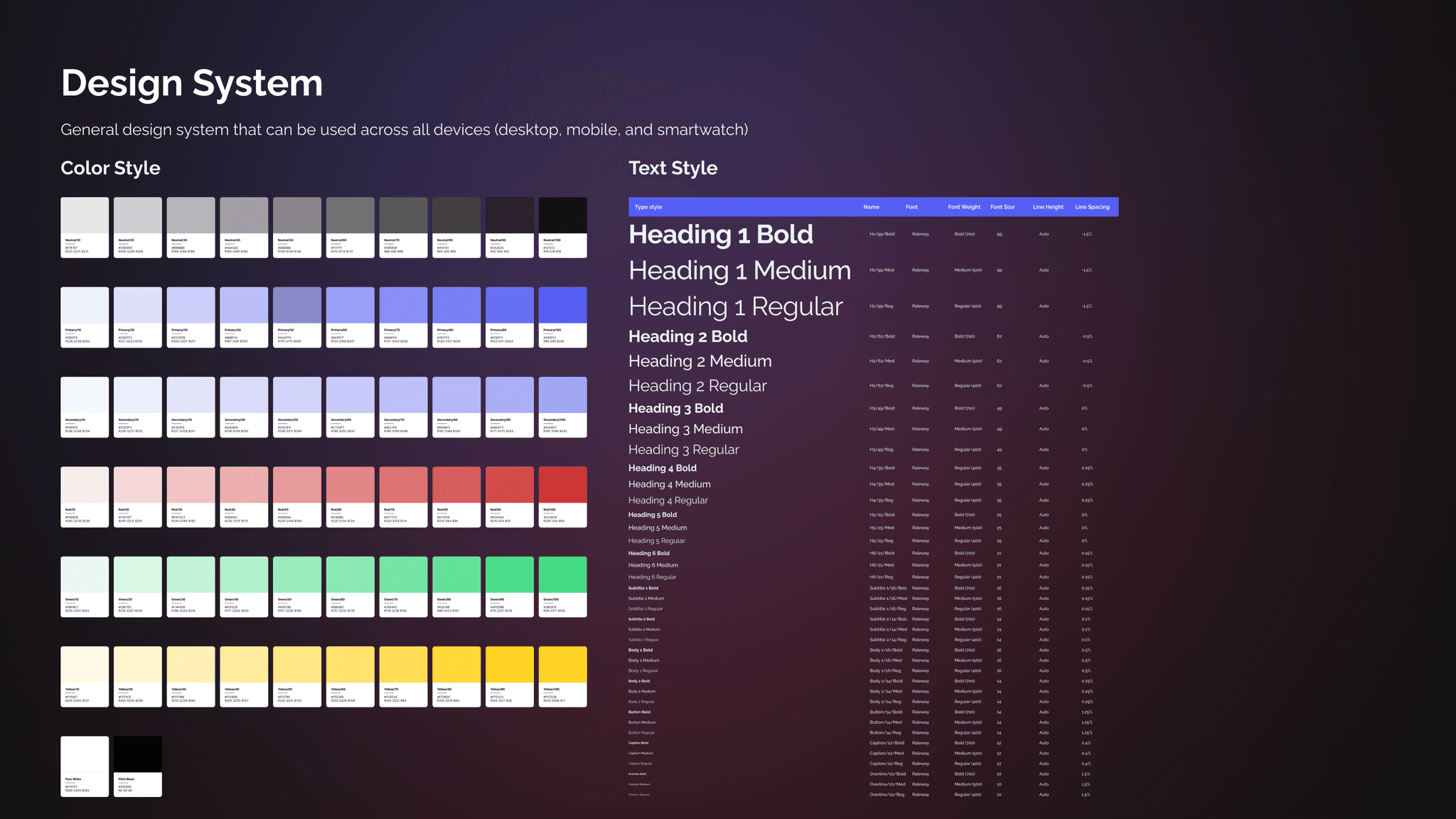
The app is designed in dark mode to enhance visibility during nighttime use—an essential consideration for an event like Vivid Sydney. Dark mode also helps reduce eye strain and conserve battery life on wearable devices. Purple was chosen as the primary brand colour, inspired by the subtle purple hues of the night sky illuminated by the light of the stars. Vibrant accent colors, sourced from Adobe Color, are used to represent different crowd density levels. To maintain a lively and approachable aesthetic, we chose Raleway typeface for its elegant curves and modern, friendly appearance.
Design is basically a never-ending iteration. At this stage, I conducted numerous iterations before settling on a final solution. Starting from exploring different layouts to iterating based on heuristic evaluation.
Initial wireframe
1st Iteration
Evaluation
This screen contain excessive text which violates one of the usability heuristics, Aesthetic and Minimalist Design.
2nd Iteration
3rd Iteration
Evaluation
Here I aimed to reduce text and adjust font sizes to establish hierarchy, but the screen remains too cluttered.
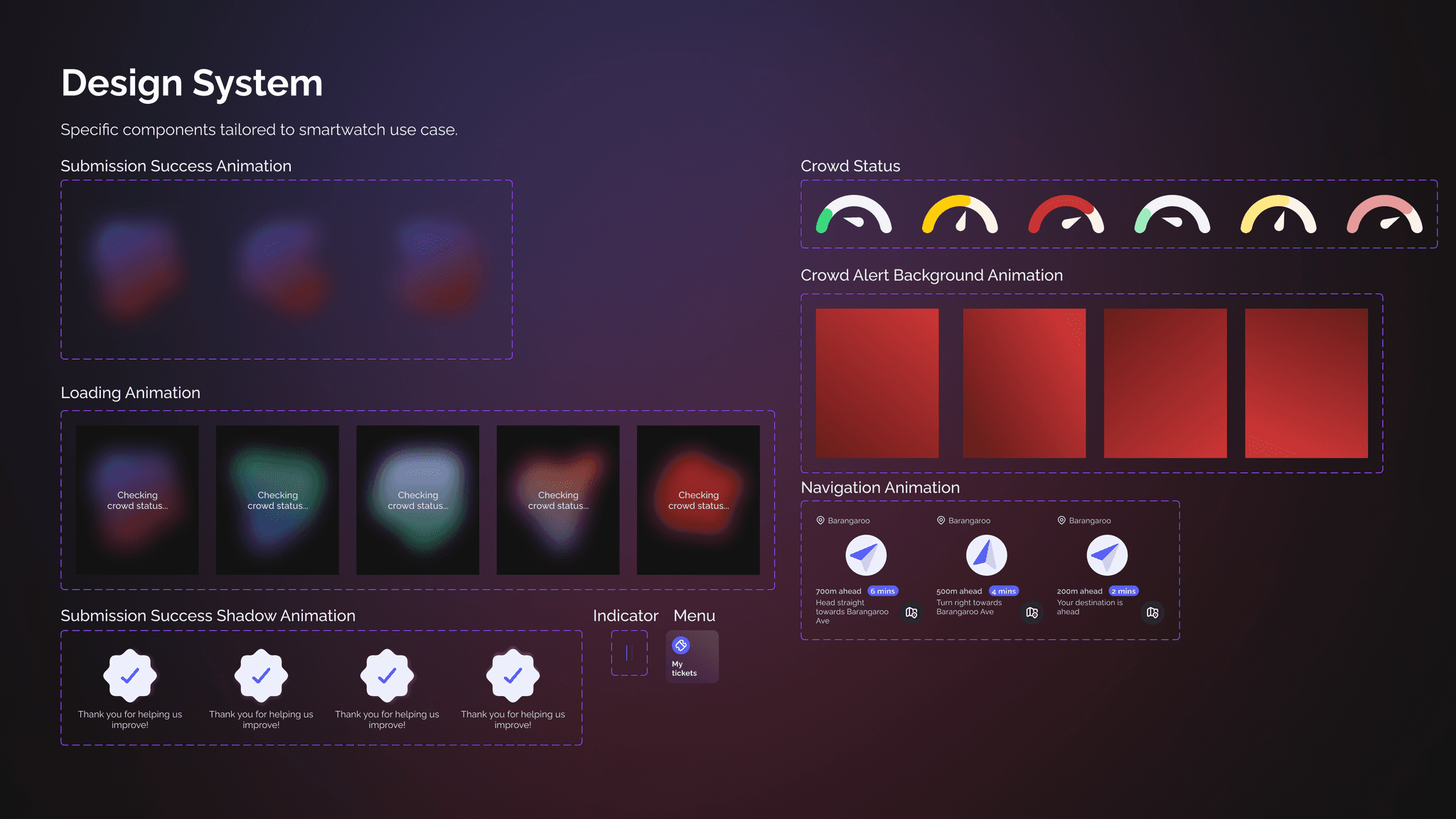
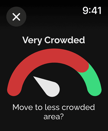
To represent crowd density, I drew inspiration from a car dashboard that indicates capacity, matching system and the real world. Based on prior research, users require crowd estimates, so I will incorporate that information. The visual and color combination in the third iteration is confusing, prompting another round of iteration.
4th Iteration
Design principles
Design principles used in the final design are as follows.
Red is chosen as the background colour for nighttime alerts as it creates a strong contrast, increasing visibility. Research indicates that people have more intense reactions to long-wavelength colours like red compared to shorter wavelengths. Psychologically, red is associated with emotional responses, often signalling danger.
I applied the aesthetic and minimalist design principle by keeping the text brief while ensuring clarity of information.
Key informations related to the crowd (e.g. location and crowd status) are kept closer, aligned with the law of proximity.
Heuristic Evaluation
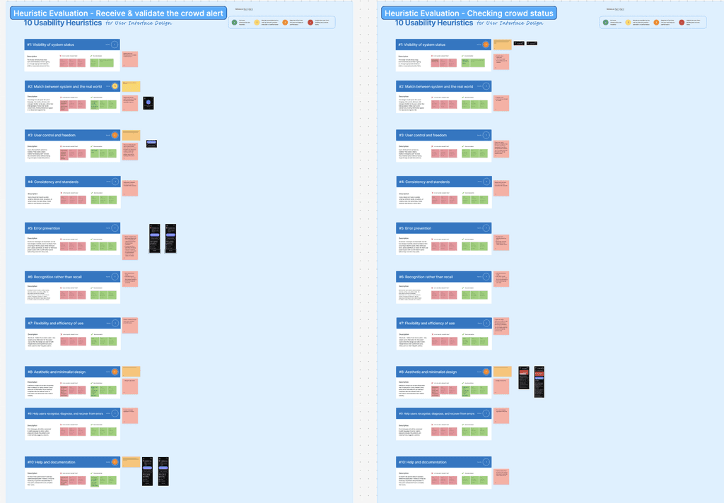
Key Insights
Success areas
Utilises familiar words and icons relevant to the context.
Maintains consistency in terminology, colour, and overall style throughout the app
Implements error prevention, such as disabling buttons before selection to avoid empty submission.
Problem areas
Certain text lacks sufficient detail, potentially confusing users about control, freedom, and the visibility of the system’s status.
The initial design contained excessive text, increasing visual complexity, which can hinder the user’s ability to process information effectively.
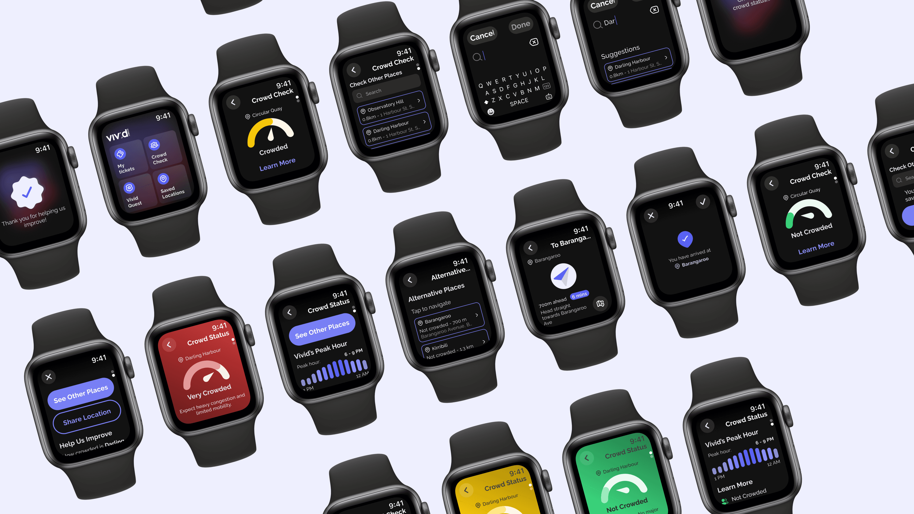
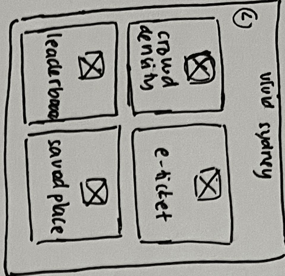
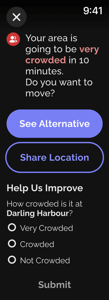
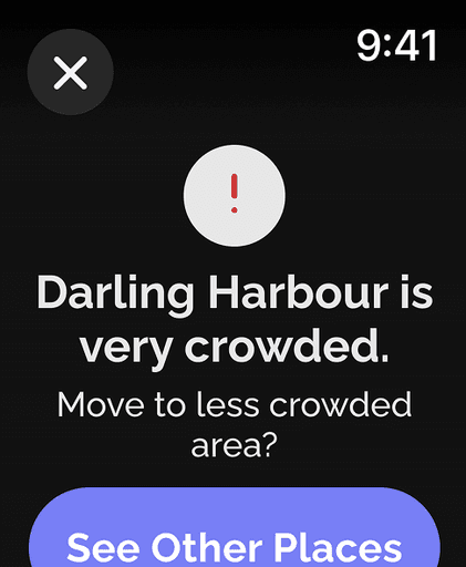
The final solution addresses two core use cases: (1) receiving and validating crowd status, and (2) checking the crowd status of specific locations. Users are alerted when their current location becomes highly crowded, and they have the option to validate the crowd status—encouraging community engagement and fulfilling the design brief. Additionally, users can proactively plan their visit by selecting specific locations to view real-time crowd density information, helping them navigate the event more confidently and comfortably.
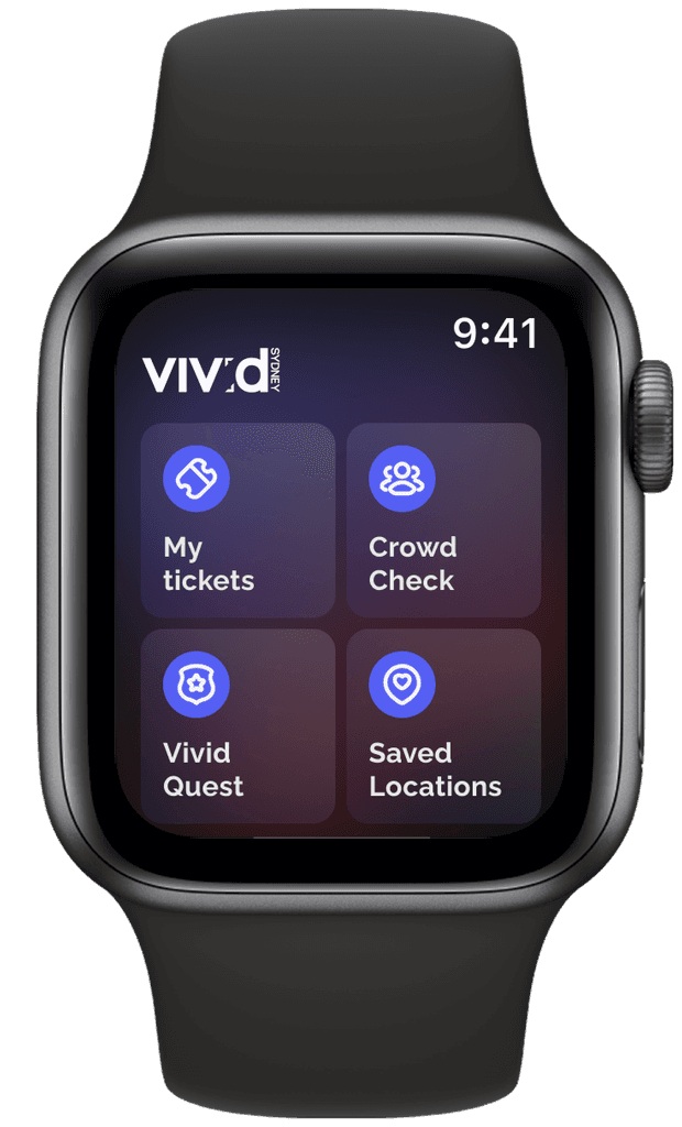
Homepage
The logo is placed on the app’s home screen to reinforce branding and provide users with immediate confirmation that they’re in the correct app—supporting the principle of system status visibility. In line with Apple’s Human Interface Guidelines, the top navigation bar uses standard WatchOS components to maintain consistency and familiarity across the platform.
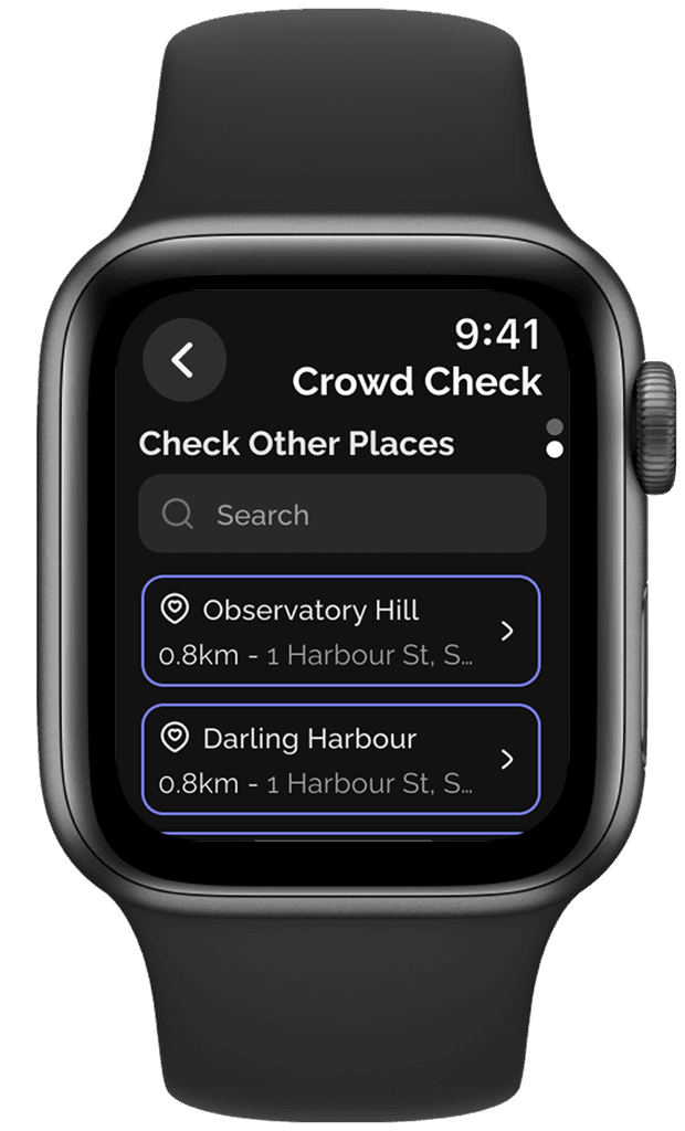
Crowd Check
As the primary function of the app, users are immediately greeted with the crowd status of their current location. Users can check the crowd density of a specific location by scrolling down to the next page.
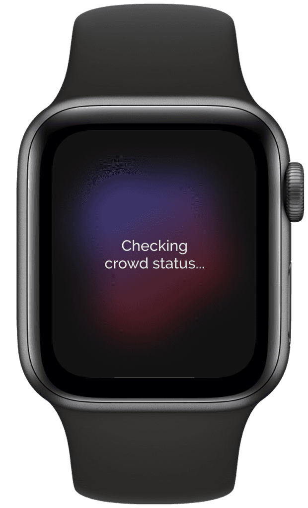
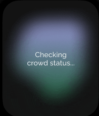
Loading Screen
User’s main goal in this flow is to check the crowd status. This screen is leading user to the peak of the journey. According to the Peak-End rule), the peak experience matters the most. To enhance user experience, a subtle animation is added.
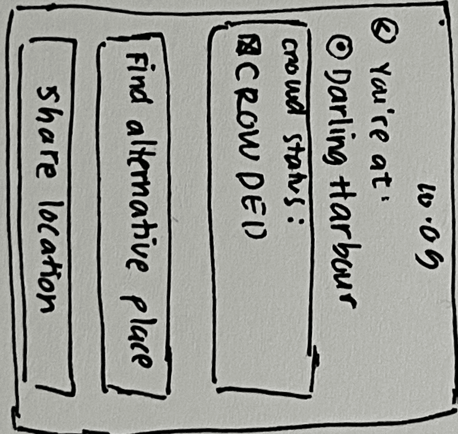
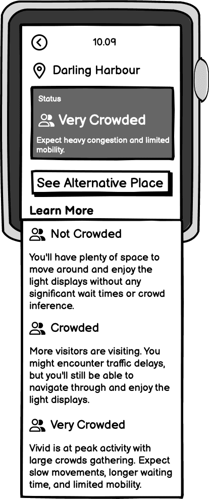
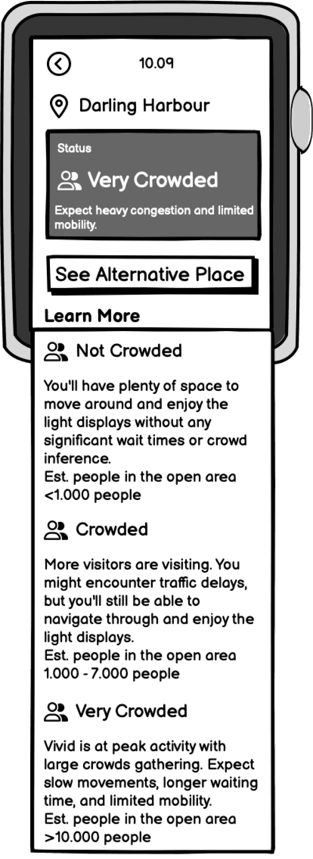
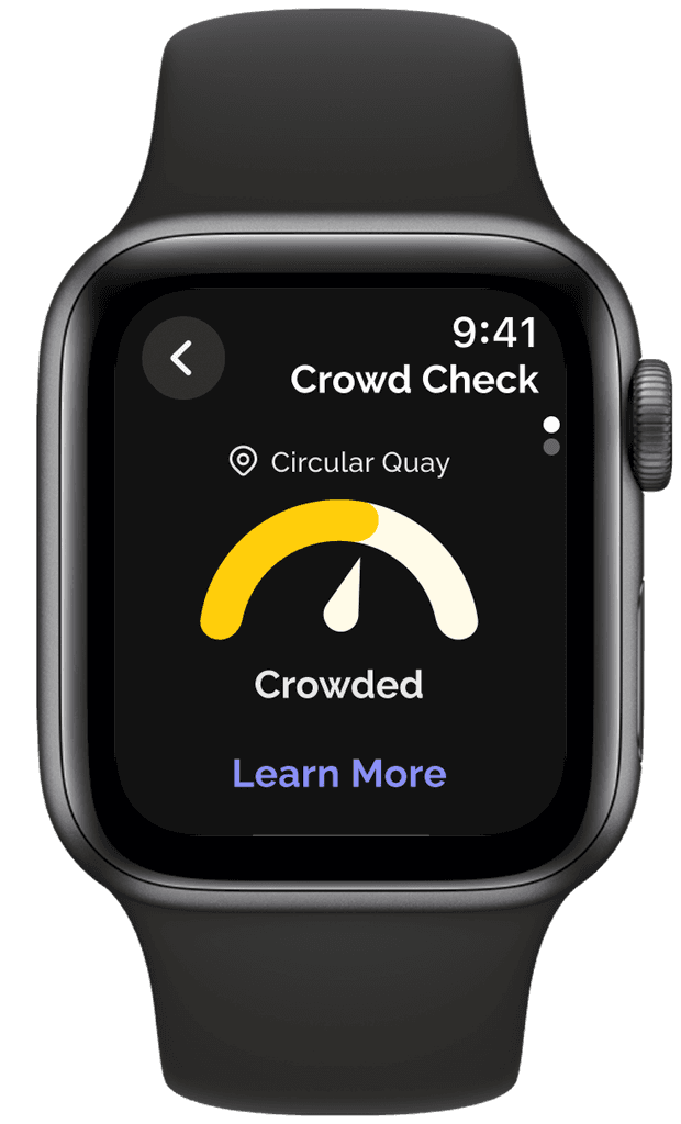
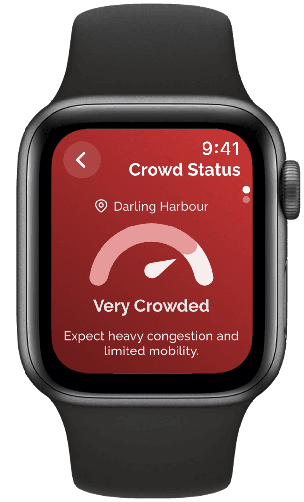
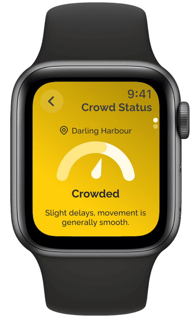
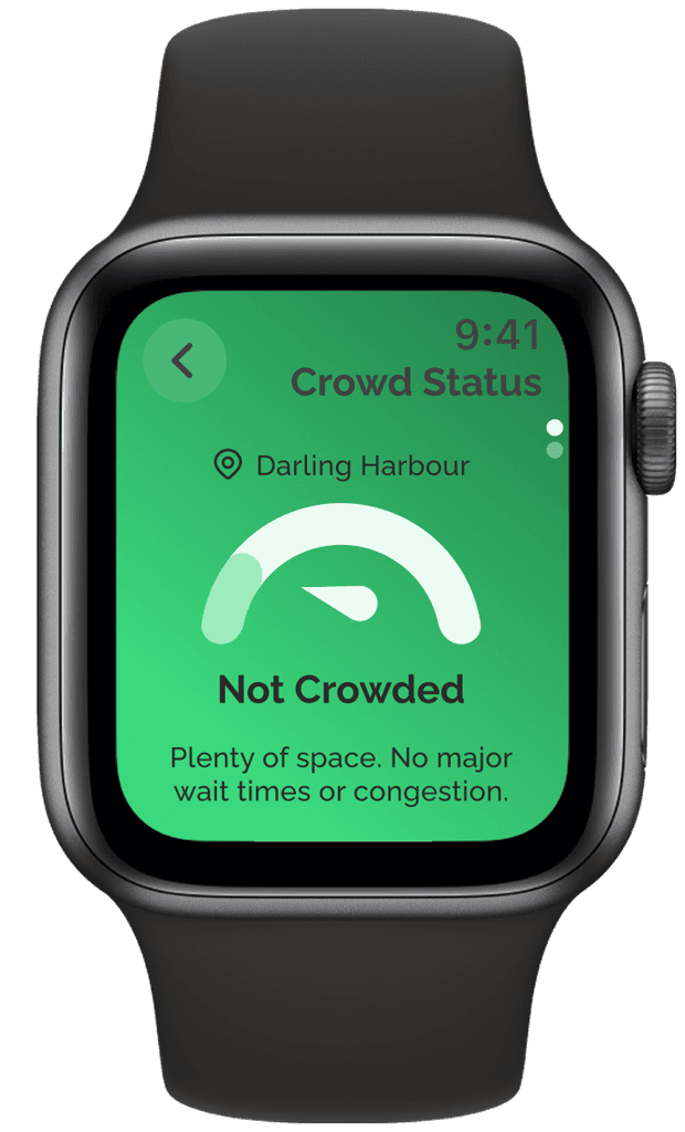
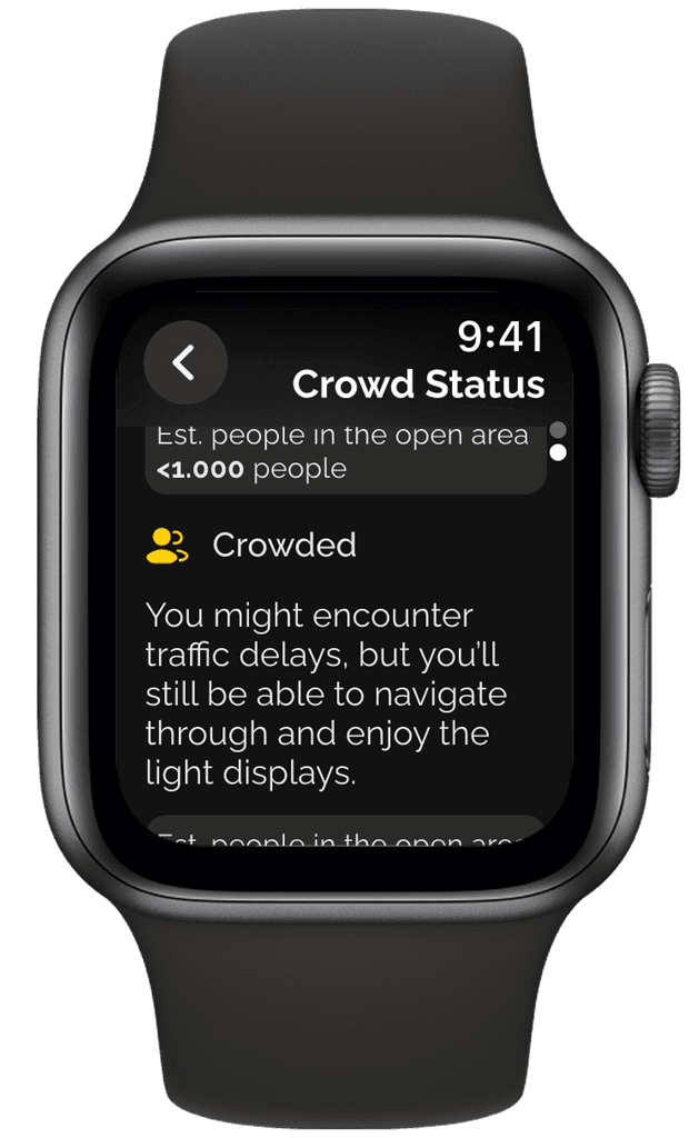
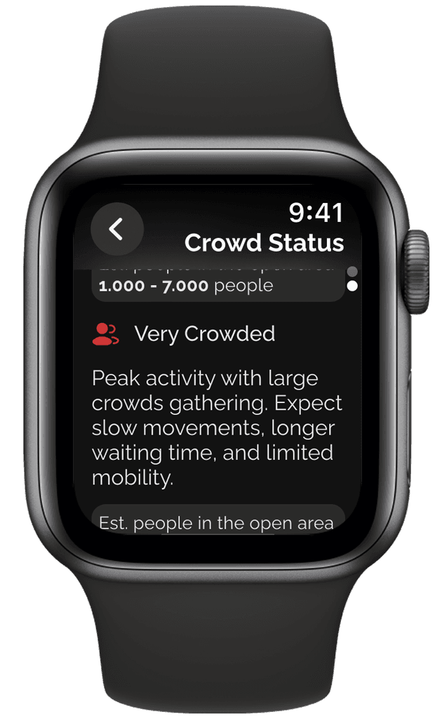
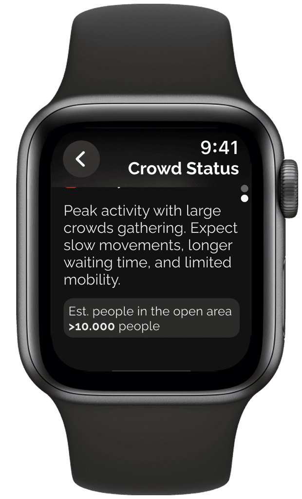
Crowd Status
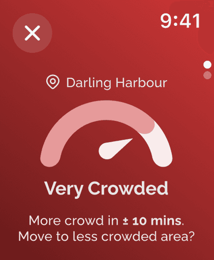
This screen highlights the app’s core feature: the crowd density status. It appears after a user checks a location or receives an alert about high crowd levels. A bold background color is used to signal urgency, while maintaining accessibility—meeting the WCAG contrast ratio of 6.45:1 for readability.
Crowd Status (Description)
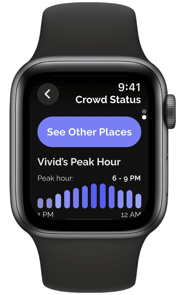
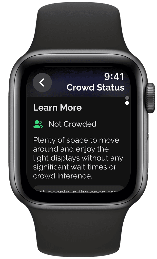
To help users interpret crowd status, a follow-up screen includes brief descriptions and a graph showing peak hours—designed to reduce cognitive load. Key details, like estimated crowd numbers, are highlighted based on user feedback. If the location is very crowded or crowded, the screen also suggests alternative nearby spots, supporting smoother decision-making and enhancing the overall experience in line with the peak-end rule.
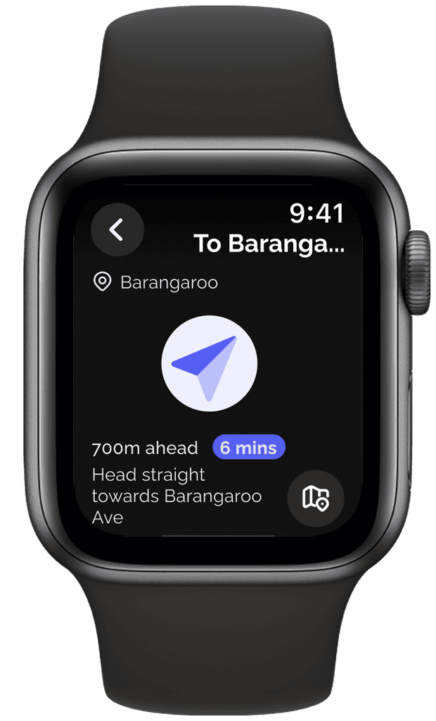
Navigation
To enhance users' experience, the app guides users to alternative locations, highlighting key information like ETA. A full map view is also available for those who prefer a broader navigation option.
Explore the full posters and prototype for a complete look at the design process and final experience.

Designing for watchOS was a valuable departure from my usual workflow and pushed me to think differently about space, interaction, and user context. Adapting UX principles to a wearable format required a strong focus on clarity, minimalism, and quick decision-making.
Coming from an in-house corporate environment, this project was a refreshing opportunity to lead an end-to-end design process—from user research and ideation to iterative prototyping and usability testing. It deepened my appreciation for designing with constraints and reminded me how meaningful design can emerge when technology meets real-world challenges.