Overview
The MyBluebird app stands as the frontline interface of the esteemed Blue Bird Group, a leading taxi enterprise in Indonesia. Beyond the fundamental taxi reservation function, this app empowers users to secure car rentals and dispatch packages seamlessly. In the pursuit of facilitating access to Blue Bird's exceptional services, this case study delves into the artistry behind designing the MyBluebird registration and password recovery processes, shaping user interactions into memorable experiences.
Role
Product Designer
Timeline
Q1 - Q3 2023
Scope
Problem definition, desk research, UX design, UI design
Background
Towards the end of Q4 2022, we found a problem in the password reset journey. Surprisingly, the success rate was a mere 20%*, falling short of expectations. As we dug deeper, significant problems arose during registration.
The problem
Collaborating with the product manager, together we analyzed our initial problem which was the reset password journey. Then, we looked at reviews from the App Store & Play Store to gain more insights and analyze the current journey of the app. Aside from the customer side, there’s also a huge problem from the internal side which was raised by the stakeholders.
Customer problem
The low success rate in the reset password journey due to wrong and invalid email
Users struggled to find the register button, leading to frustrations and failed attempts.
A lot of invalid login cases due to wrong phone numbers. It is because the app doesn’t provide a country code in the phone number input form.
The app hasn’t provided a clear TnC for users to agree when they sign up.
Internal problems
Using SMS OTP for international numbers, the company had to pay a lot of money (around 20 million yearly)
The vendor had issues that caused a lot of fraud and abuse cases so it adds even more to company cost.
SMS OTP for international numbers isn’t effective anyway because our taxi system can’t call customers with international numbers.
Users are not aware of the TnC, this may cause future problems for the app.
These critical matters directly impact user onboarding. If users can't smoothly navigate through registration and login, it limits their ability to engage, such as booking a taxi. Addressing these concerns is pivotal for an enhanced user experience and successful interactions.
Setting goals and objectives
Therefore our main goal is to create a seamless registration and password recovery experience while maintaining a low cost for the company.
Our key objectives were to:
Increase the number of validated emails to ensure a smooth password recovery journey
Provide clear information about the country code and TnC
Increase the number of registered users
Reduce the OTP cost for registration
Who are our users
Based on regular research conducted by our research team, we know that our users are busy urban commuters, tourists/travelers, corporate clients, and entry levels/students.
They felt unsafe using regular public transportation
Some have language barriers (e.g tourists)
They value transportation services that takes safety and security seriously
Need something quick and efficient


From this knowledge, it is important for us to ensure security and clarity while still maintaining an easy, quick, and efficient experience to our users. Especially during the onboarding process which is an entry point into using our app.
Design process
After clearly defining our problems, goals, and objectives, I started to do one of the quickest ways to gain insights and inspiration which is benchmarking.
Benchmarking is a quick and easy way to conduct a ‘mini’ research to find out how competitors do it. This was also done to ensure that our proposed solutions won’t be too unfamiliar to the users since the registration & onboarding journey is a basic necessity for most apps.
To solve the password recovery issue, I had to provide several alternative solutions because we had limitations at the time:
We currently rely on email to reset the password. However, most of the registered emails aren’t validated yet, we need to find a way for users to recover their passwords without having to add OTP cost
We’re thinking of switching to using WhatsApp OTP but still haven’t found the right vendor yet
Providing alternative login such as SSO wouldn’t really solve users forgetting their password problem, because the actual problem is the users don’t enter the right email when they register so they don’t receive the email OTP code to reset their password
Providing alternative logins takes a lot of technical effort, with the current backlog and everything, this has to be put on low priority because it won’t have as much impact on our current problem
So what I did was I provided several options for users to reset their password while maintaining low cost for OTP usage.

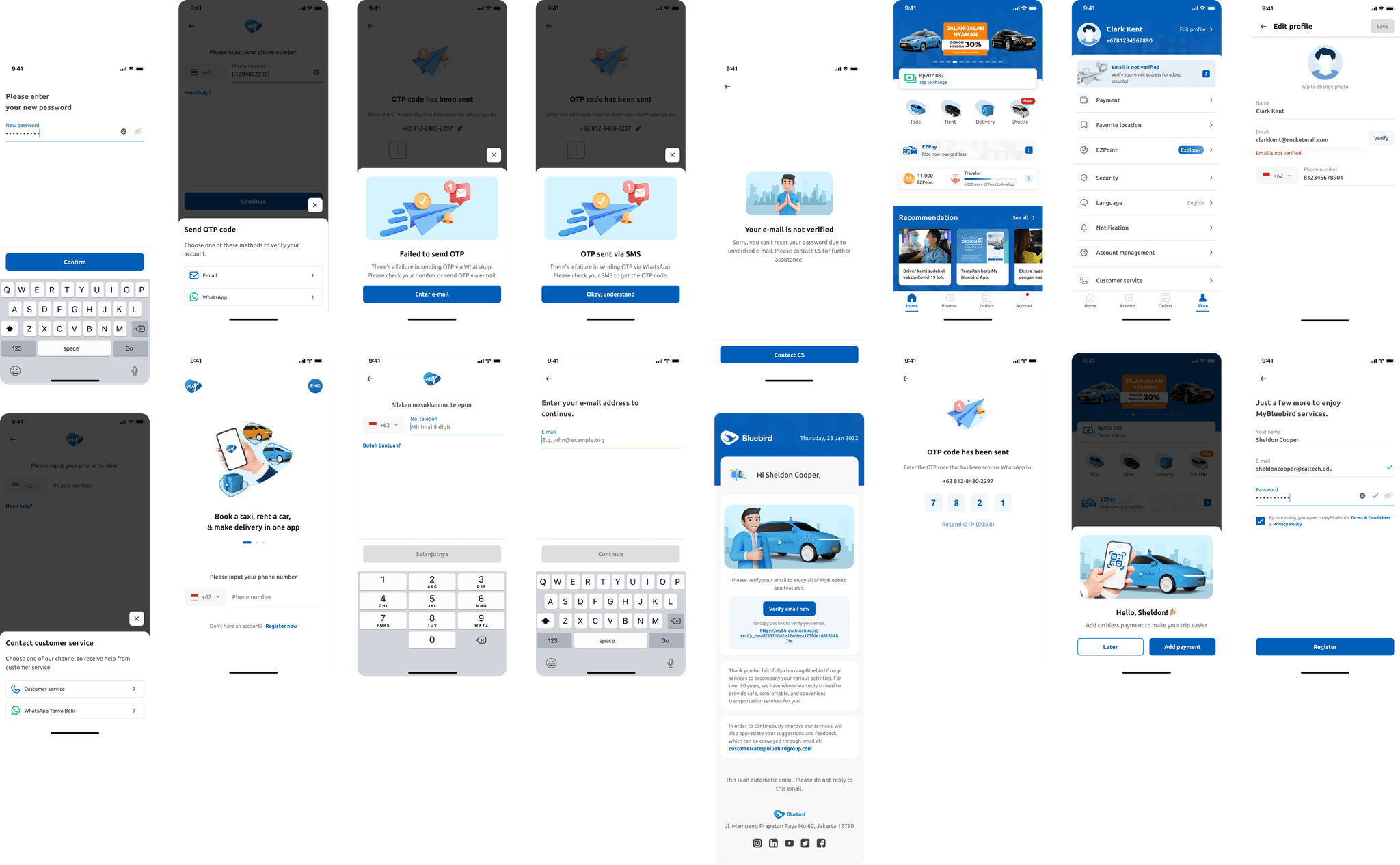
As a product designer, the main deliverables expected is the interface design. So here’s the final interface design produced.
Registration process
To increase the number of registered users, I added a register button to clarify that there's a way for users to register. However, the button isn't a primary button because users can actually enter their phone number to register.
A country code is also added next to the phone number form to increase awareness among the users.
I also added a help button as a mitigation in case users are having problems with their OTP which is the next step after this.

As for the OTP issues, we eventually decided to use WhatsApp OTP. However, for international numbers, we provide two ways for them to verify their identification; WhatsApp OTP & e-mail OTP. This decision was made because international numbers don't need to be verified as our taxi systems are unable to call the numbers anyway. As for domestic numbers, it is necessary to verify the number, hence we only provide WhatsApp OTP for them.
In both domestic number & international numbers, there is failover logic provided. For instance, WhatsApp OTP isn't working on domestic numbers, hence the OTP is sent via SMS because we must verify their number. As for international numbers, if the OTP isn't sent to their WhatsApp number, the failover logic is to send the OTP to their email.

At the end of the registration process, we made sure that users were aware of the Terms and Conditions by adding a checkbox next to the TnC link. The register button is only enabled after the user checks the checkbox.
Previously, the TnC is only a hyperlink which has a high probability of not being seen by the users. By adding a checkbox next to it, at least users are aware of the existence of the TnC to prevent legal issues in the future.

Email verification process
After the registration process, we encouraged users to verify their email addresses by adding a red dot on the account menu.
After that, users will see a banner that informs their current email status. I decided to use a banner to appeal visually and give better exposure because it is important to have users’ emails verified.
Password recovery process
Since the major problem for the previous password recovery was the unverified emails, it is prevented by having an email verification journey after the registration process. However, this won't solve the current problems.
To solve the current problem, we decided to use WhatsApp OTP instead of email OTP to make it easier for users to recover their passwords. We made sure to include the failover logic for both domestic & international numbers.
After the design was released, we monitored the result and impact.
After 2 weeks of release, there is a 90% increment in email verification*
However, not everything ran as smoothly as expected
There hasn’t been a significant increase in the number of registered users. This means we need to evaluate the design.
Note: the OTP enhancement hasn’t been released so I can’t provide the impact yet
This was a long-term project because there is a lot of coordination required between stakeholders and vendors. We were also doing other things in from the backlog so we didn't dedicate a certain timeline for this project alone. Despite all that, I learned a lot about collaboration in this project.
As we track the impacts, we realize that there is always room for improvement. Hence, this design can still be very much improved.
p.s *exact numbers are omitted & rounded due to NDA